The UX case study template I'd use (built around decisions, not screens)
Copy the template, answer five uncomfortable questions, and you'll have the case study. The screens come last.

Most UX case study templates are a project timeline with headings.
Context. Problem. Research. Wireframes. Final design. Results.
Fill that in and you get a museum tour. Every room in order. Nobody remembers any of them.
The template below is different on purpose. It's built around the decisions you made, because that's what hiring managers and stakeholders are actually trying to judge. Not whether you did research.
Whether they'd trust your judgment in the messy middle of a real project.
The UX case study template (copy and paste)
# [Result-first headline: what changed, for who]

## The decision
- What decision did the team need to make?
- What was at stake if we got it wrong?

## Context (keep it short)
- Product, users, and the moment this happens in
- Only what's needed to understand the stakes

## The constraint that made it hard
- Time, tech, data, politics, legacy, accessibility

## What we tried first
- The obvious answer, and why it looked right

## What went wrong
- How we found out it didn't work
- What surprised us

## What we changed
- The tradeoff we made, and what we gave up for it
- The 2-3 screens that show the decision (not all of them)

## What happened after
- The number, with a baseline
- Or expected impact, labeled as an estimate

## What I'd do differently
- One honest sentence
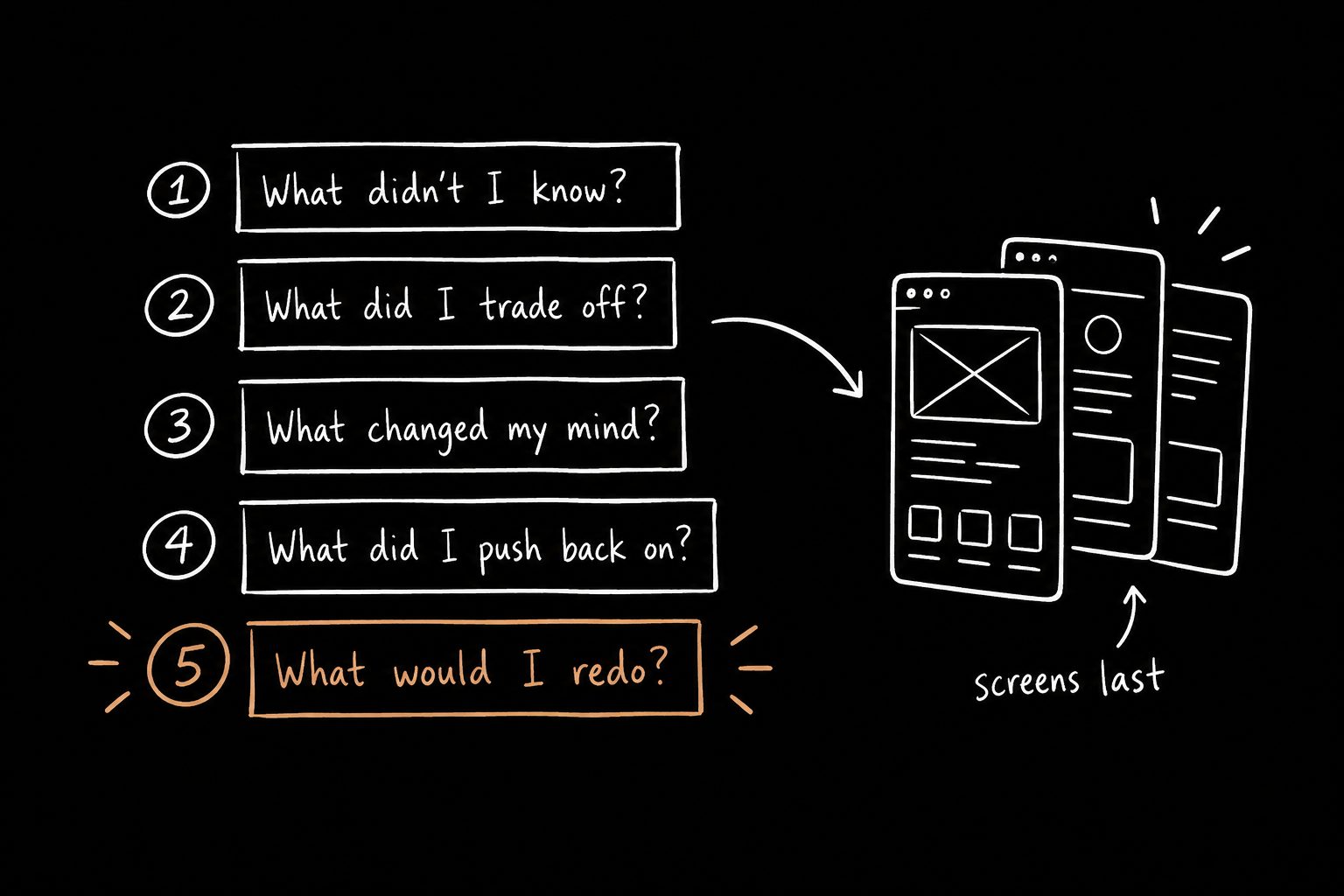
Notice where the screens are. Near the end, attached to a decision. That's on purpose.
Five questions that pressure-test the story
Before you write a single sentence, answer these for the project:
- Where did I have incomplete information?
- What tradeoff did I make?
- What did I believe at first that changed?
- What did the team want that I pushed back on?
- What would I do differently if I had to do it again?
Those five answers usually contain the actual case study.
The rest is supporting material. You don't need to explain the whole project from beginning to end. You need to help people understand what was at stake, what you decided, what you traded off, and what happened after.
If you can't answer them, that's useful too. It means you know what you made, but not yet why it mattered. Which is exactly what this template forces out.
How to write each section
The headline. A result, not a project name. "Got account managers back into the product every Monday" beats "Dashboard redesign" every time. See more before-and-after rewrites in my UX case study examples.
The decision. One or two sentences. If the reader doesn't know what was at stake by the end of this section, nothing after it lands.
Context. The section everyone overwrites. Give just enough to understand the risk. Company history, team structure and your process go in an appendix, if anywhere.
The constraint. This is where your judgment starts to show. Anyone can design without constraints. The job is designing inside them.
What went wrong. Don't skip it. Don't soften it. A case study where nothing went wrong reads like fiction, and everyone in the room knows it's bullshit.
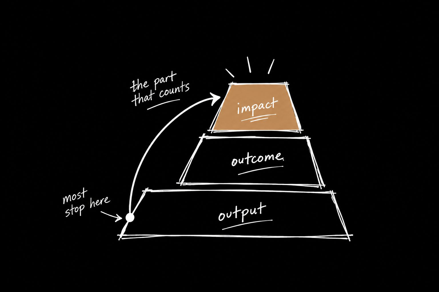
What happened after. Put a number here if you have one, with a baseline. A number with a baseline is what makes the work undeniable. If you don't, use conservative math and call it expected impact. Here's how to pick UX metrics people actually care about.
What I'd do differently. One sentence. It's the line people remember, because almost nobody writes it.
Same rhythm, every case study
Pick this structure and repeat it across every project.
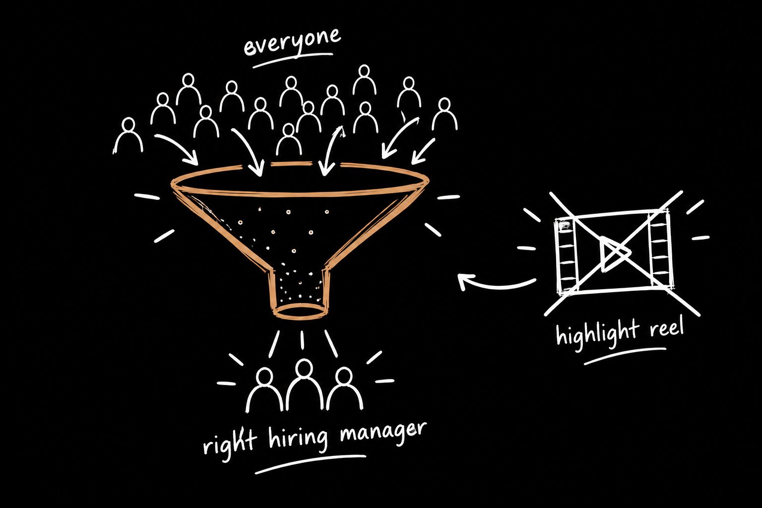
Once a hiring manager learns the rhythm on case study one, every one after it gets easier to skim, because they already know where to find the payoff. That consistency is what gets you from open tab to interview request.
It works on your portfolio homepage too: sort projects by outcome, headline them by result, and give every case study the same exit path. Here's the portfolio homepage structure I'd copy.
Presenting the case study live
The template works on the page. In a live review, it works even better if you lead with the decision instead of the context.
People will interrupt. They'll skip ahead. They'll ask about the part you were saving for later. That's fine. That's the point. It means they're judging your thinking, not your slides.
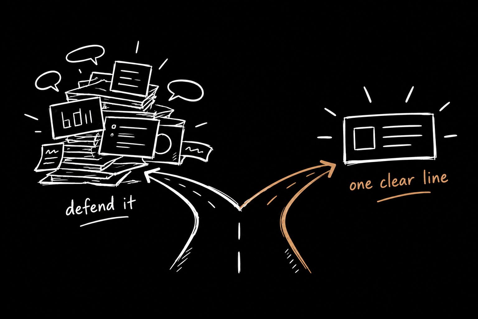
The skill that matters there is answering a question in one clear line instead of opening a new TED Talk. I wrote about how to explain design decisions without defending them.
Don't want to fill it in by hand?
The 15 Minute Case Study is a free Claude Skill that runs this exact process with you. You paste your rough notes, it asks the uncomfortable questions above, and you walk out with a draft built around decisions and outcomes. Fifteen minutes. Your notes, your Claude.
UX case study template FAQ
How many case studies should a portfolio have?
Three strong ones beat eight thin ones. Each should show different decisions: a tradeoff, a recovery from something that went wrong, and a measurable outcome.
Should I use a slide deck or a web page?
Both, built from the same structure. The page gets you shortlisted. The deck carries the live conversation. Keep the deck shorter and leave room for questions.
Can I use this template for internal case studies?
Yes. It works for promotion packets and team updates too. Swap "hiring manager" for "your manager" and the same five questions apply.
What if the project never shipped?
Write it anyway. Focus on the decision, what you learned and what the team did with it. A killed project with a clear lesson is still a strong case study.