UX case study examples that prove what the work was worth
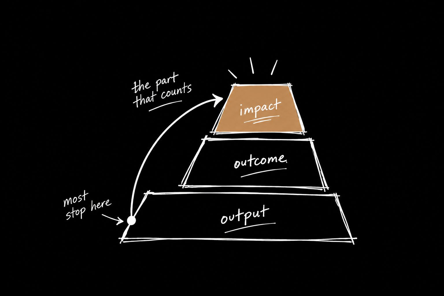
Most case studies describe what got built. The ones that land show what changed because of it. Here's what separates them, with before-and-after examples.

There's a specific kind of silence that happens in a portfolio review.
It's not dramatic. Nobody throws a chair. It's smaller than that.
The hiring manager stops nodding. Someone looks at the slide thumbnails instead of the slide you're on. One person is still smiling, but it has the same energy as a flight attendant during turbulence.
The work might be good. The case study might be strong. But you can feel it slipping.
So you explain more. The research. The constraints. The stakeholder context. The metric that moved, sort of, but only if you explain the launch conditions first.
All the shit that mattered, delivered in the least useful order possible.
I've looked at a lot of UX case studies. The good ones aren't better designed. They're better structured. Here's what they have in common.
What strong UX case study examples have in common
1. They're organized around decisions, not the timeline.
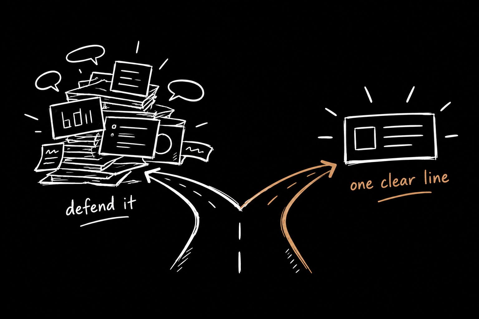
Weak case studies follow the project:
Company context → problem → research → flows → final design → results.
That's usually how the work happened. It's rarely how anyone wants to hear it.
Strong case studies follow the decisions:
- What problem deserved attention?
- What tradeoff shaped the solution?
- What changed after you learned something uncomfortable?
Now the screens have a job. The research has a job. The metric has a job. They're not random stops on a museum tour anymore. They support the decision.
2. The headline is the result, not the project name.
A project name asks for trust before you've earned it. A result earns the click.
3. The screens are receipts.
Nobody needs every screen. They need the screens that explain the decision. Everything else goes in an appendix or a backup slide.
4. There's a section on what went wrong.
This is the one most designers leave out, and it's the one that builds the most trust. More on that below.
5. The number lands where it explains the decision.
Show the metric too early and it feels disconnected. Too late and people are gone. Put it at the moment the reader understands why it mattered.
Before and after: case study headlines
These are illustrative rewrites, not real projects. The pattern is what matters.
| Weak headline | Strong headline |
|---|---|
| Onboarding redesign | Cut week-one drop-off by changing one step in onboarding |
| Dashboard 2.0 | Got account managers back into the product every Monday |
| Checkout flow | Removed the step where half of mobile buyers gave up |
| Design system migration | Shipped features 30% faster by killing 40 one-off components |
The weak column describes what you made. The strong column describes what changed. Only one of those gets read.
If you don't have the number yet, that's not a writing problem. It's a measurement problem, and you can still fix it. Start with the UX metrics that actually make it into the exec deck.
The "what went wrong" section
I always include a slide that says what went wrong.
Not buried. Not apologized for. Not treated like a weird little secret you hope nobody asks about.
A real slide.
Here's what we launched. Here's why we thought it would work. Here's how we found out it didn't. Here's what we changed after reality punched the first version in the mouth.
That slide does a lot of work. It tells people you're not precious. It tells them you can read the room after launch. It tells them you don't need the project to look perfect for your judgment to look credible.
Nobody needs another goddamn case study where every project magically starts with ambiguity and ends with a clean business impact slide. That's a bedtime story for recruiters.
A UX case study example, structured by decisions
Here's the flow I'd use for almost any project. It works on a page and in a live presentation:
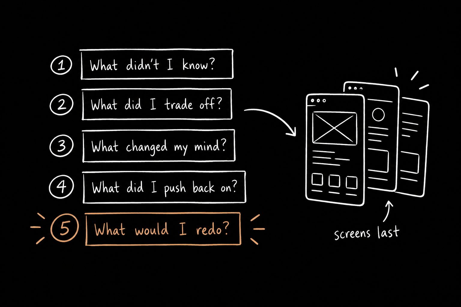
- The decision we had to make.
- Why the obvious answer was risky.
- What we tried first.
- What went wrong.
- What we changed.
- What happened after.
- What I'd do differently now.
That's enough.
Keep the research, the extra flows and the edge cases ready as backup. Just stop putting everything in the main path like you're afraid the appendix will feel lonely.
If you want this as a fill-in-the-blanks doc, here's the UX case study template built on exactly this structure.
Where most case studies actually die
Designers spend weeks tweaking their portfolio site, then practice the presentation twice, alone, five minutes before the interview.
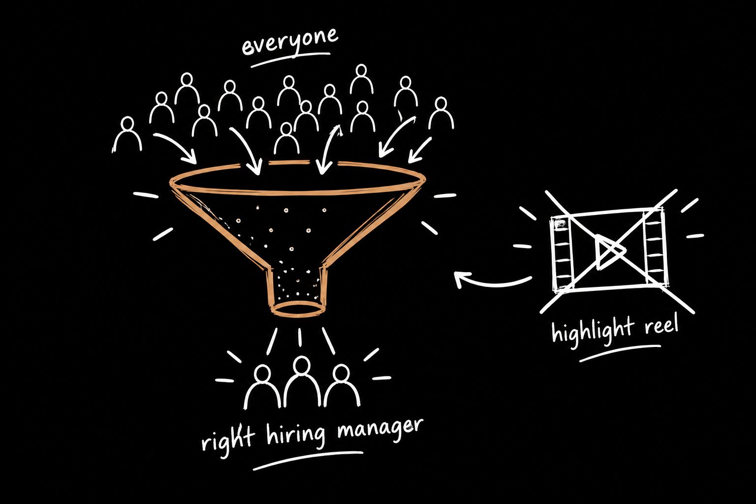
That's backwards. The site gets you into the room. The story decides what happens once you're there.
And the story is about judgment. Where did you push? Where did you compromise? Where did you change your mind? Where did you stop the team from building something expensive and stupid?
That's what hiring managers are listening for. The screens are just receipts.
If you're presenting live, there's one more skill worth building: explaining a call in one line instead of one slide deck. I wrote about how to explain design decisions without defending them.
Where to put your case studies
Structure matters on the portfolio homepage too. Sort by outcome, not by date, and make every preview headline a result. Here's the product designer portfolio homepage structure I use.
You can see how I write up my own work on my case studies page.
Or skip the blank page entirely
The hardest part of a case study is the first draft. You know the project. You just can't get it out of your head and onto the page in a shape that proves anything.
That's why I built The 15 Minute Case Study. It's a free Claude Skill. You paste in your rough project notes, it asks what actually changed and why you made the calls you made, and you walk away with the business story.
And if you can't fill in the numbers, that's the real finding.
UX case study FAQ
How long should a UX case study be?
Long enough to show three decisions and what happened after. For most projects that's a five to seven minute read, or ten minutes presented live, with backup material ready if someone asks.
Should I include failed projects?
Yes, if you can say what you learned and what you'd do differently. A failed project told honestly often builds more trust than a polished success.
What if I signed an NDA?
Describe the decisions and the shape of the impact without the confidential detail. "Reduced support tickets for the feature by roughly a third" is usually fine. Ask if you're unsure.
What if I don't have metrics?
Use expected impact with conservative math, and say clearly that it's an estimate. Then make measuring the outcome part of your next project.