The product designer portfolio homepage structure that sells before anyone scrolls
Most portfolio homepages are a highlight reel. Yours should be a filter. Here's the structure, section by section.

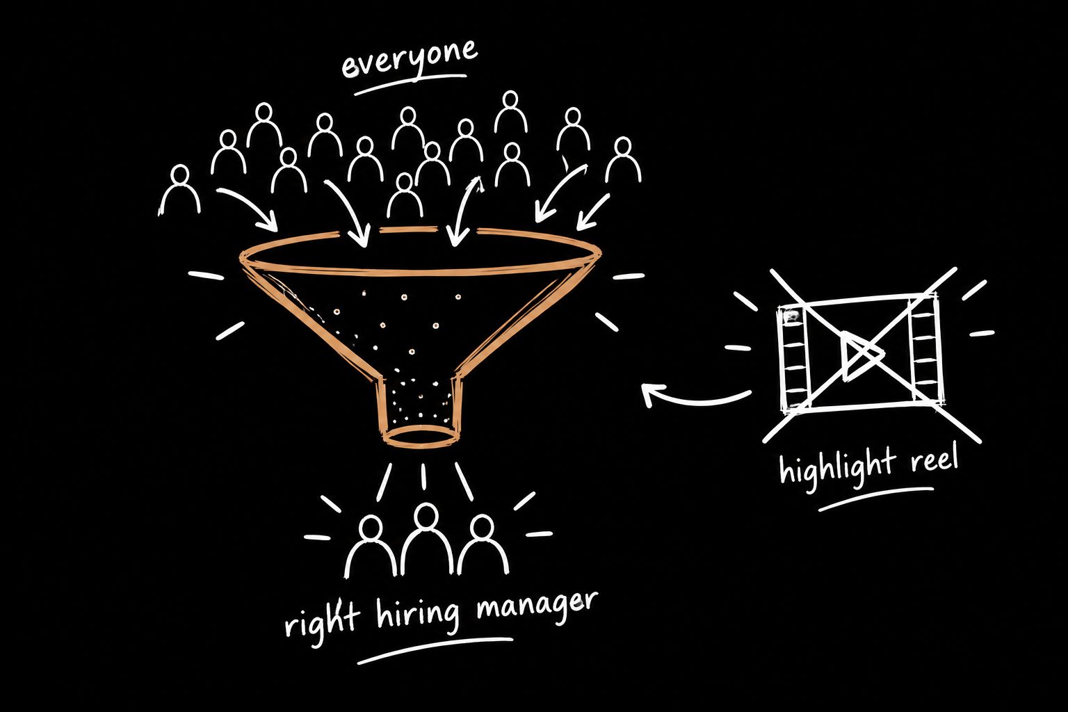
Most product designer portfolio homepages are a highlight reel.
Mine is a filter.
Different job. Different structure.
A highlight reel tries to show everything you've done. A filter tells the right person, in a few seconds, that you solve their problem, and gives everyone else permission to leave. That sounds harsh.
It's actually the kindest thing you can do for a hiring manager skimming ten portfolios at the end of a long day.
Here's how the homepage is laid out, piece by piece.
1. The hero: one sentence, no ambiguity
No vague mission statement. No list of skills. No "I'm a multidisciplinary designer passionate about people." Nobody gives a shit, and they're right not to.
One line that states the outcome you create, in business language.
Most people use the hero to describe themselves. That's backwards. The hero should describe the reader's problem and the fact that you solve it. It's not about you.
It's about them, and what changes once they work with you.
If you can't say what you're worth in a sentence, nobody's reading past it.
This is the line someone reads in the three seconds before they decide to keep scrolling or close the tab. Make it count.
2. The proof strip: numbers before narrative
Right under the hero, three stats.
Not screenshots. Numbers.
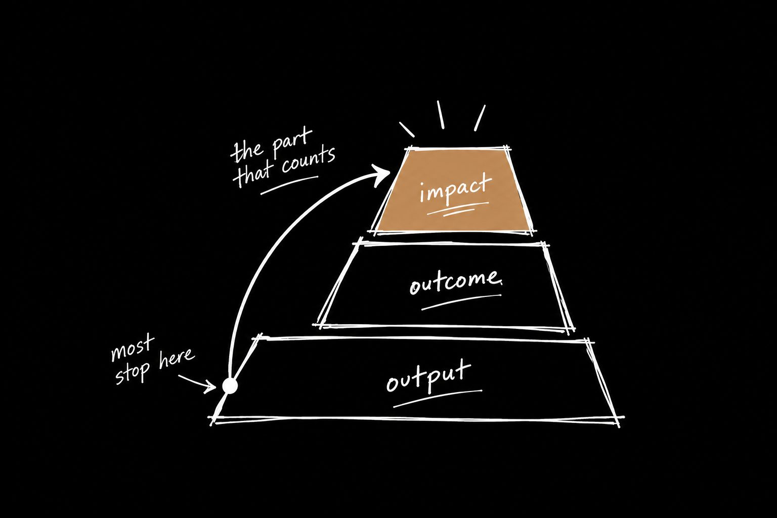
Before anyone reads a single case study, they already know the shape of your impact.
This is the section most portfolios skip entirely, and it's the one doing the most work. Nobody reads your homepage. They scan it. Give them a reason to keep going in the first five seconds or lose them to the next tab.
Don't have three numbers? That's not a portfolio problem. It's a measurement problem, and it's fixable. Start with the UX metrics that actually make it into the exec deck.
3. The case study grid: sorted by outcome, not chronology
Most portfolios sort by date. Sort yours by the business problem you solved.
Conversion. Retention. Adoption. Efficiency.
Someone scanning for a person who can move the metric they care about finds the answer in five seconds.
Chronological order tells a story about your career. Outcome order tells a story about their problem. Only one of those gets the callback.
4. Case study previews: the headline is the result
Not a project name. Not a client name. The result it produced.
A project name asks for trust before you've earned it. A result earns the click first.
"Dashboard redesign" is a label. "Got account managers back into the product every Monday" is a reason to click. I've got more before-and-after rewrites in UX case study examples.
5. Inside the case study: same rhythm every time
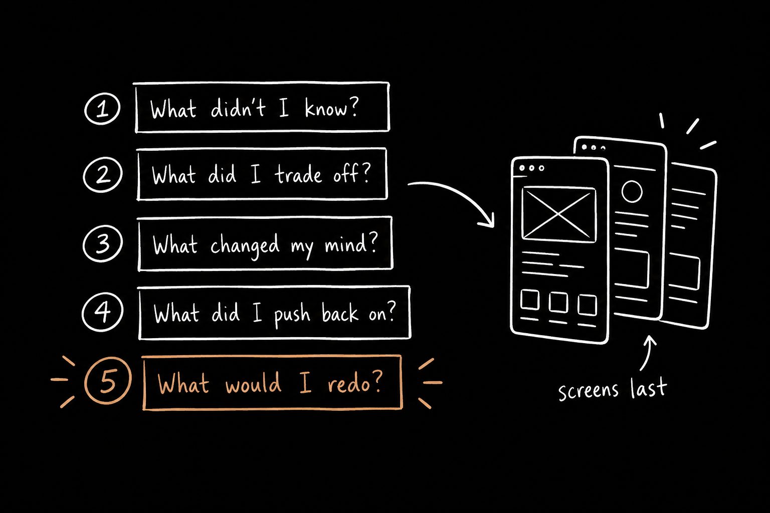
Problem. Constraint. Decision. Number.
No design process tourism. Nobody wants the fucking moodboard. They want the so what.
Consistency matters more than people think. Once a reader learns the rhythm on case study one, every one after it gets easier to skim, because they know where the payoff lives.
If you want that rhythm as a fill-in-the-blanks doc, use the UX case study template. It's built around decisions instead of screens.
6. The exit path: every case study ends the same way
Not "thanks for reading."
A specific next step. Reach out. Book a call. See the next case study.
The homepage's job doesn't end when someone finishes reading. It ends when they take the next step toward actually talking to you. Someone who just read proof that you move metrics should never have to hunt for how to contact you.
Make the path obvious. Make it short.
One structure, repeated on purpose
| Section | Its one job |
|---|---|
| Hero | Say the outcome you create, in one sentence |
| Proof strip | Show the shape of your impact before any reading |
| Grid | Let people find the problem they care about |
| Previews | Earn the click with a result |
| Case study | Prove the result with a decision |
| Exit path | Turn interest into a conversation |
That's not a portfolio. That's a machine that pre-sells you before the first interview.
The portfolio gets you in. The story decides what happens next.
Here's the trap. Designers spend weeks polishing the website, then practice the actual presentation twice, alone, five minutes before the interview.
The portfolio gets you into the room. The presentation decides what happens once you're there. And in a live review, people interrupt, skip ahead and ask about the decision you thought was obvious.
They're judging your thinking, not your typography.
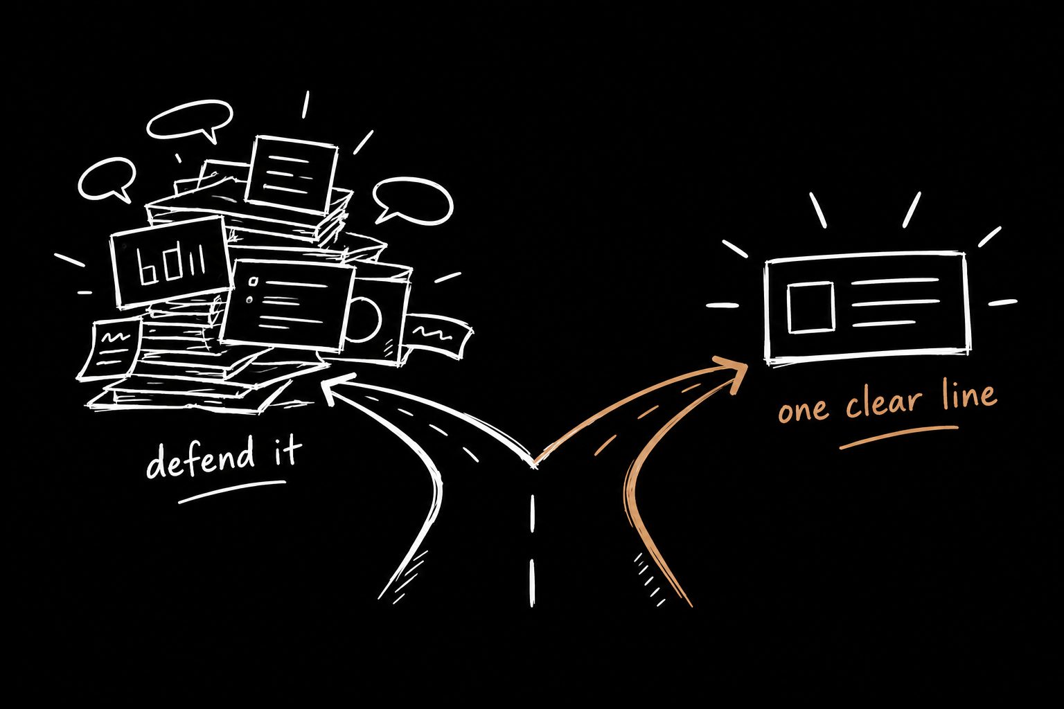
So once the homepage is done, practice saying each decision in one clear line. I wrote about explaining design decisions without defending them.
You can see how I lay out my own work on my case studies page.
Start with one case study
You don't need to rebuild the whole site this week. Take your strongest project and rewrite it so the headline is a result and the body follows decisions.
The fastest way to do that is The 15 Minute Case Study, a free Claude Skill. Paste your rough notes, answer the questions it asks about what actually changed, and you'll have the draft. If you can't fill in the numbers, that's the real finding.
Product designer portfolio FAQ
How many projects should a product designer portfolio have?
Three to four strong case studies. More than that dilutes the good ones and gives skimmers more reasons to stop.
Should my portfolio show visual design or business impact?
Both, in that order. Lead with visuals and you get filed under pixel pusher. Lead with impact and the visuals become proof that you can execute it.
Does the platform matter?
Barely. A simple site with a clear structure beats a beautiful one that makes people work to understand what you do. Pick whatever you can update quickly.
Should I put metrics on my portfolio if they're estimates?
Yes, if you label them as estimates and keep them conservative. Visible, honest math reads as confidence. Inflated numbers read as fiction.